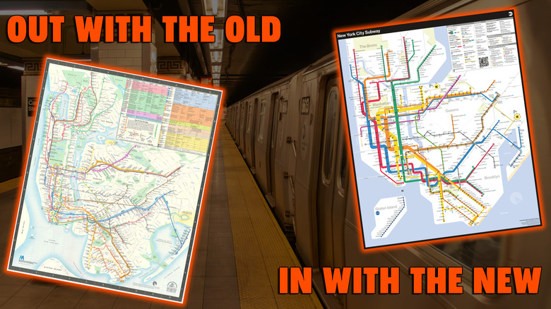
New York City’s subway map has been largely unchanged since 1979, when a committee led by the Metropolitan Transit Authority laid those now instantly recognizable colors over the streets of the five boroughs. But the map has had some real problems with readability for all of its 46 years, and it requires knowledge of express and local lines that most tourists simply don’t have. Now, finally, the MTA has given us a replacement: A shiny new early-’70s-inspired map of New York’s subways.
The new layout ditches the street map entirely, instead returning to the more abstracted view of the beloved 1972 map from Massimo Vignelli. Subway lines are no longer mapped out with exact curvature, but with lines as straight as possible. The lines also no longer merge when running together, leaving it unclear to newcomers which lines stop at which stations, but run as parallel groups that easily demonstrate whether you’re on the right train. It’s a map that’s both prettier and more legible.
The 1972 Vignelli map is a clear influence
The new map includes plenty of details the 1972 map left out — small, unimportant things, like Staten Island — but the earlier map’s influence is clear. The new map shares the Vignelli version’s basic shapes and angles, but introduces more contrast and clarity while preserving the modern color scheme. The new map even includes the Long Island Rail Road and Amtrak as intra-city transit options, in case you feel like spending extra to get from 34th Street to Jamaica.
The new design may not be perfect — the scale of the map underestimates how much walking is required to get around parts of Brooklyn and Queens — but it’s beautiful and useful enough that the little issues don’t seem like they matter. It’s really just such a gorgeous design. I want this new subway map as a wall print, a full back tattoo, or possibly both.


