


Inspired by the Peregrine Falcon
The redesigned emblem will first be shown on a new concept car debuting on July 8 that Bentley says isn’t a production-intent vehicle but will “herald the start of a new era of design language.” The concept’s reveal will coincide with the opening of Bentley’s new three-story design studio that lives within the original headquarters in the factory at Crewe, headed up by director of design Robin Page, who has led the department since 2023 and oversaw the logo redesign. Bentley says, “the mission in designing the new emblem was to capture some of the beautiful details from the previous designs – for example, the diamond pattern of the inner wings and the B ‘centre jewel’ – but create a more modern and progressive design.”
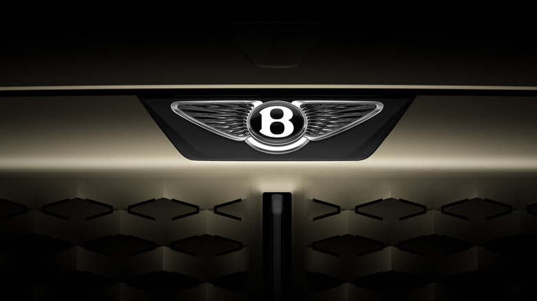
A competition was held in the design department where the whole team could submit sketches and ideas. The chosen proposal was from Young Nam, an interior designer, and the team iterated on it from there. Inspired by the angled wings of Peregrine Falcons, the emblem’s wings are more triangular and completely ensconced, with their pattern looking more like Bentley’s crystal-inspired diamond motif than feathers. There’s no more feathers under the B, and that “jewel” has a thicker surround with a beveled glass edged and chamfered metal surround, so the three-dimensional B can be used on its own without the wings. On the upcoming concept car the Winged B is illuminated, lighting up in an animation along with dozens of arrow-shaped LEDs in the grille panel. It’s vastly more modern than previous Winged B designs, but without falling into the trap of too-flat logos like Audi’s recent redesign.
The Winged B over the years
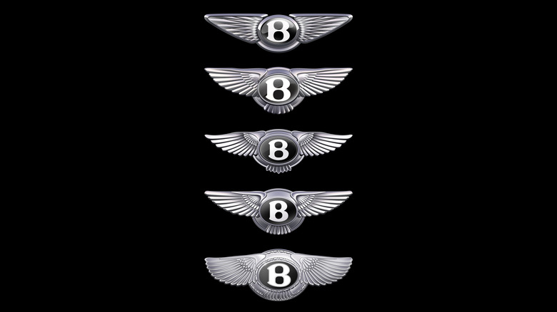
The original Winged B was designed in 1919 by F. Gordon Crosby, a famous automotive artist for Autocar and friend of W.O. Bentley. It was inspired by “the exhilaration of motion” and Bentley’s history making fighter plane engines in WWI, and the two wings got a different number of feathers so it couldn’t be easily replicated. The logo was redesigned in 1931 when Bentley was acquired by Rolls-Royce, and that more symmetrical iteration lasted until 1996, when it was tweaked to be a bit more in line with Crosby’s original. The 2002 redesign went back to asymmetry with 10 feathers on the left and 11 on the right.
Speaking about Bentley’s emblem, Robin Page says, “If a luxury brand is the product of the stories it has created, then its emblem is its signature. In more than a century of history, this is only the fourth evolution of Bentley’s iconic Winged B, and redesigning it was a formidable task for which we’ve taken great care. In an era of ever-increasing complexity and fidelity from digitalisation, an exercise of simplification and refinement is a modern necessity – and so the new emblem is cleaner, sharper and more impactful than its predecessor. The new Winged B – and the concept car that introduces it – both symbolise a powerful, exciting future for this company and its exceptional, handcrafted products.”
It’s unclear exactly what sort of vehicle this new concept car will be, but I’m hoping for something really dramatic and wild like the EXP100GT. At least we can see it’ll still have a retractable hood ornament.