Sometimes, I am very confused by the choices car companies make when it comes to the interiors of their vehicles. There’s a lot of two-steps-forward, one-step-back stuff going on, and a great example of this is drive mode selectors. Car companies have decided that even on the most mundane of vehicles, the drive mode selector needs to be front and center, and that is just as dumb as rocks to me.
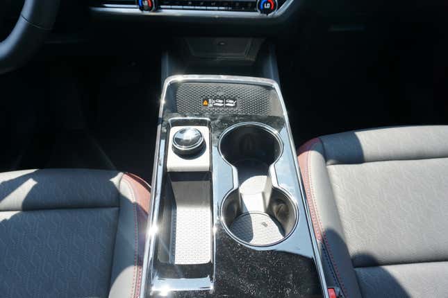
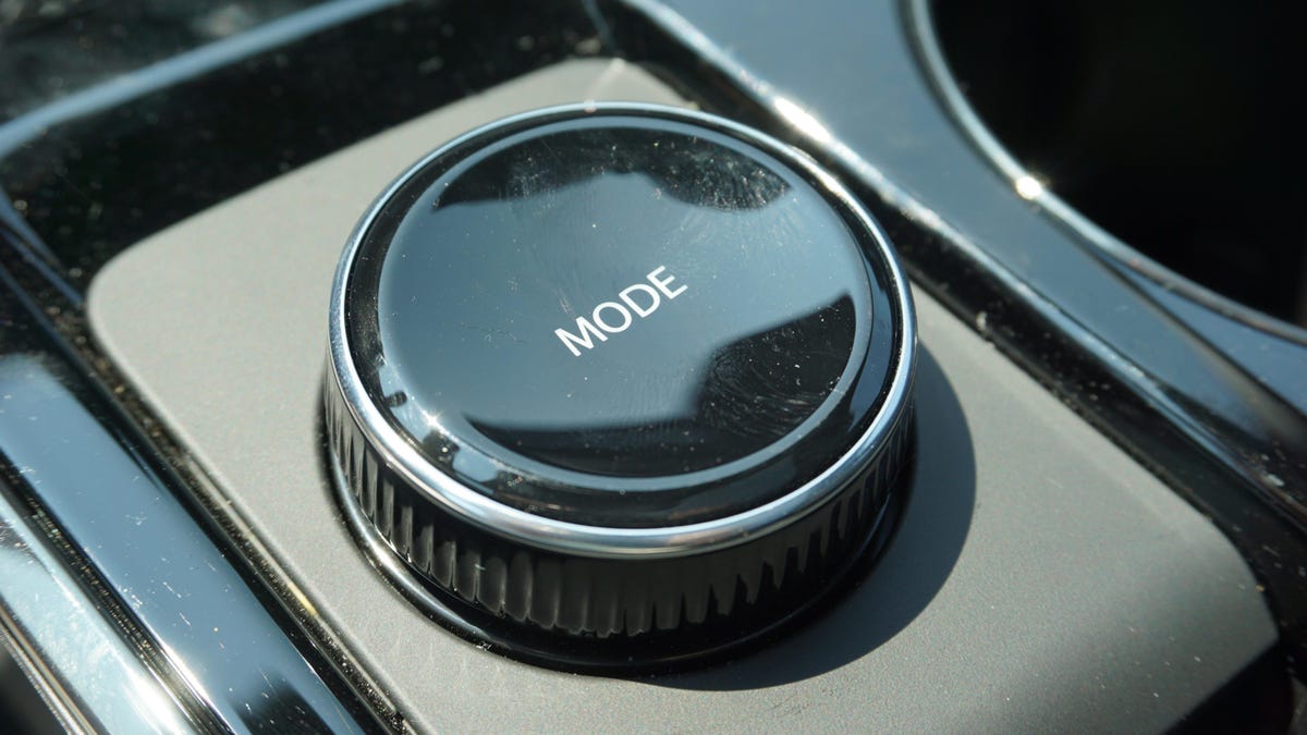
I had this revelation while testing the new 2025 Chevy Equinox. Overall, it’s a sold little crossover with a well-thought-out interior, but its goddamn drive mode selector drove me nuts. On all-wheel-drive cars, it’s placed very conspicuously in the center console, and I don’t understand why. It has just three drive modes: normal, off-road and snow/ice. It doesn’t need those modes, and even if it did, just make it a small button. There’s no reason to have an iDrive-knob-sized wheel in a place that could be better used for storage or cup holders or whatever for a feature zero Equinox owners will ever actually use.

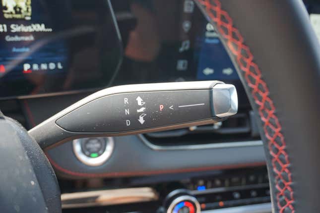
To bring my two-step-forward, one-step-back theory into the fold: Chevy took the time to move the gear selector from the center console to the steering column for the new Equinox. This was a great move, in my opinion, that more automakers should be copying. It opened up the console for cubbies and cup holders and whatever. Unfortunately, the “whatever” Chevy decided to implement there was the damn drive mode selector. Ugh. I should also mention that on front-wheel drive Equinoxes, there’s no drive mode selector – just a small cubby hole for change or keys. That’s all it needed. General Motors had the technology to do this but chose not to.

OK, to be fair to Chevy, it’s far from the only automaker to do something like this. One of the biggest offenders in this area, to me, is Acura. It places a massive drive mode selector right in the middle of the dashboard on just about every car it makes – including large family crossovers with zero sporty character. It’s just a huge waste of space to me, and I’m not going to get over it until drive model selectors are just small buttons relegated to a part of the interior that won’t get in anyone’s way. That’s all they really deserve, anyway.


