


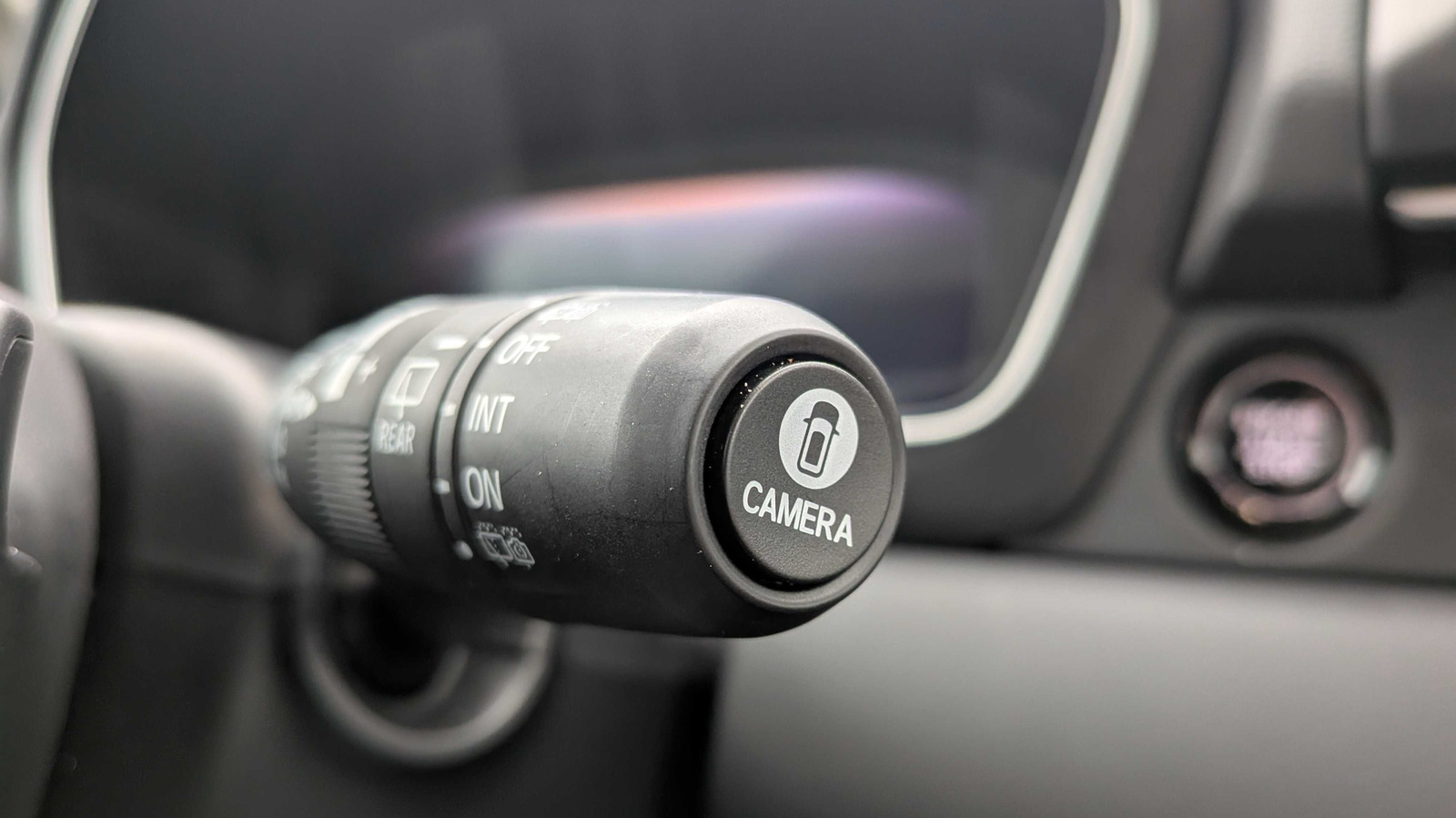
When we talk about newer features that started showing up in cars within the last couple of decades, Apple CarPlay is always a popular one, but personally, I still marvel at surround-view camera systems. The idea is so simple, and yet, they feel a little like magic. Sure, I’d rather have smaller cars that are easy to see out of, but the technology is great. Especially if an errant pebble takes out the windshield of the Honda Prelude you were scheduled to receive, and the press car you get as a replacement ends up being a Honda Pilot that’s almost 60 inches longer than the Fiat 500e you drive daily.
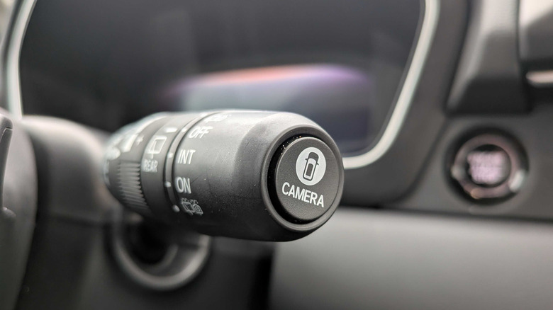
Hopping between cars that are wildly different sizes is just a normal part of automotive journalism, but especially when you’re driving something unfamiliar, it never hurts to get a little assistance from some cameras while your parking brain adjusts. I won’t pretend I have any use for a three-row crossover in my life, but dang it, Honda’s decision to stick the camera button on the wiper stalk sure did prove to be convenient. Far too many automakers stick the camera controls in some random, unintuitive spot on the dashboard or center console that forces you to reach for it, and it sucks. Just put the camera button in a spot that’s easy to reach!
I’m not going to pretend the Pilot was all that hard to park, with or without the cameras active, but I also don’t think I’m asking for too much when I say using a convenience feature should also be convenient. No sane automaker would put the cruise control buttons on the passenger side of the center console, but camera controls could pretty much be anywhere. Heck, sometimes there isn’t even a button at all, forcing you to hunt for controls in the infotainment system. I still hate all push-button shifters, including Honda’s, but putting the camera button on the wiper stalk shows Honda understands convenience features shouldn’t be inconvenient to use.
It’s no Mitsubishi Eclipse Cross though
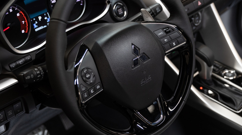
Compared to touchscreen camera controls or a physical button that may or may not be intuitive to use, Honda’s stalk-mounted camera button is a clear winner. But somehow, against all odds, the best-placed camera control I’ve ever experienced was in a car wearing a Mitsubishi badge. Specifically, the Mitsubishi Eclipse Cross, a car you’d probably hate more if you hadn’t forgotten that it existed in the first place. The Eclipse Cross was never particularly luxurious, fun to drive, or popular, but I dare you to name a car with better camera button placement.
Look closely at the only 2025 Eclipse Cross press photo that shows the button, and you’ll see it’s on the left side of the steering wheel, just above the voice control button. If your left hand’s already resting at the 9 o’clock position, you barely have to move your hand to double-check your parking job. And since it’s on the left, your right hand remains free to shift in and out of reverse. Sadly, Mitsubishi still won’t admit that column shifters make the best modern gear selectors, but that camera button placement is so perfect, I genuinely don’t understand why more automakers haven’t copied it.
 Mitsubishi
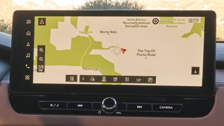
What’s even more confusing, though, is that Mitsubishi doesn’t always copy itself. Climb inside an Outlander, and you won’t find the camera button on the steering wheel at all. Instead, it’s located right underneath the infotainment screen, on the far right. Closer to the passenger than the driver. You know, exactly the spot I complained about earlier in this post. Institutional inertia could explain why other automakers haven’t copied the Eclipse Cross’s left-side-of-the-steering-wheel button, but Mitsubishi doesn’t have that excuse. It’s been building the Eclipse Cross since 2017, and the button’s been there since the beginning.
Maybe auto journalists are just as bad at understanding UX/UI as we are at product planning, and regular car buyers are perfectly happy with whatever automatic camera settings their cars come with. Maybe I’m talking about a feature normal drivers barely use. But do they not use the camera button because they don’t think it’s useful, or is it because the buttons tend to be annoying to use? Even I’m not naive enough to apply for a product planning position, so we’ll probably never know.

