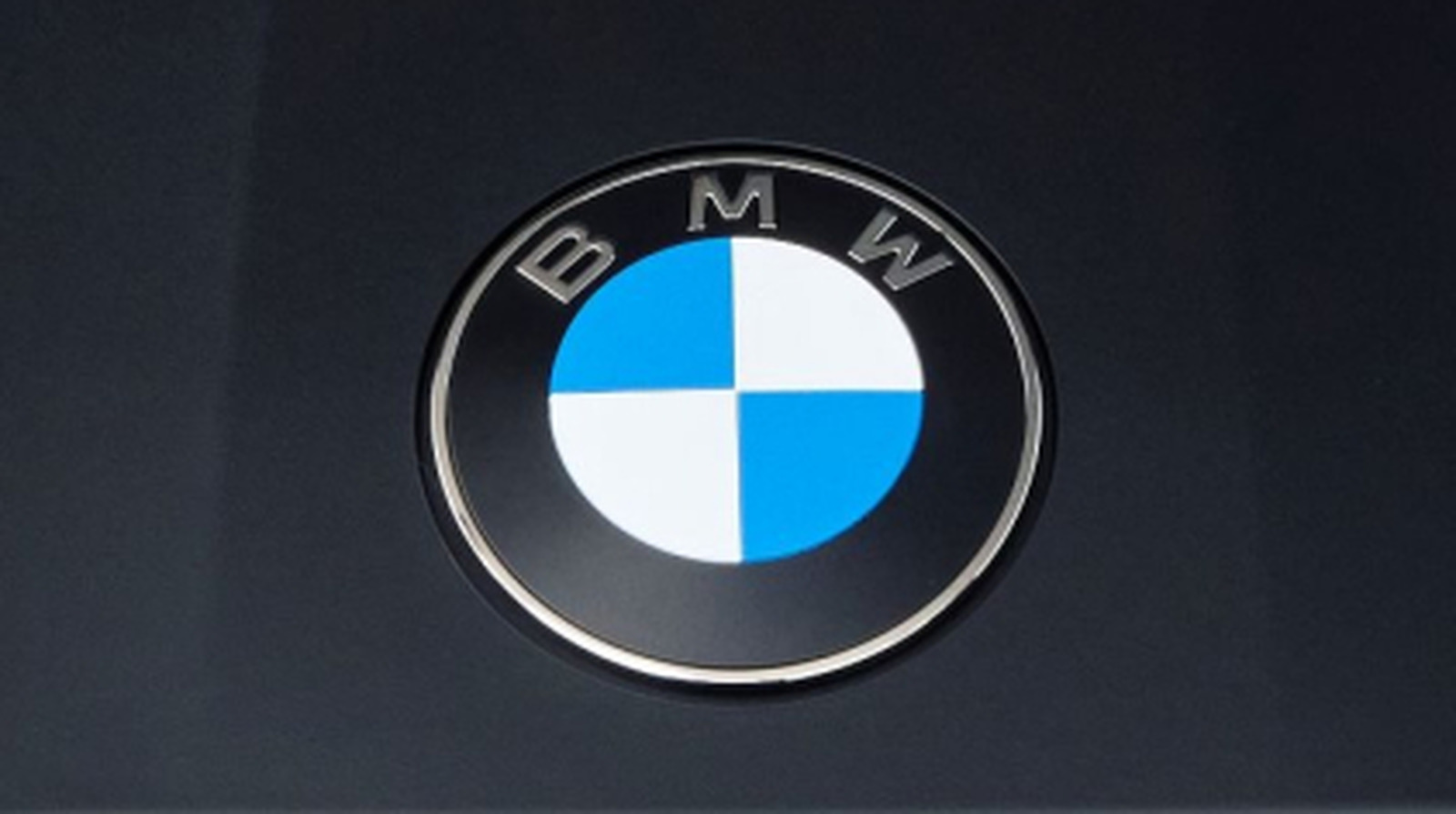
Don’t worry, it didn’t make any radical changes. In fact, BMW’s tweaking of its legendary badge is so modest that you have to squint to spot the actual differences. CarScoops took note when BMW unveiled its new iX3 at the Munich Motor Show:
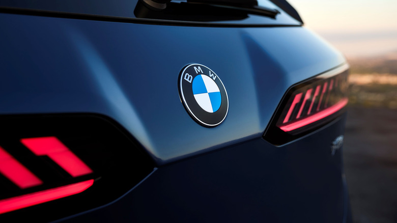
We reached out to BMW regarding the new logo featured on its electric SUV and asked whether it would appear on other models. A spokesperson told us, “The badge will debut on the iX3 and will gradually roll out to new or refreshed vehicles as they are introduced.”
The modifications are almost hilarious in their low-keyness. A ring of chrome has been eliminated, along with the crisscrossing chrome lines, the “BMW” lettering has been streamlined, and on EVs a blue outer ring has been dropped. I personally welcome that last alteration – a BMW is a BMW in my book, regardless of what powers it – but I’m not sure about losing the chrome. I generally don’t like it when brands with strong physical-world logos try to align them with print and digital iterations. BMW has apparently done this by somewhat flattening its iconic roundel for the iX3.
It’s not a propeller – well, not really
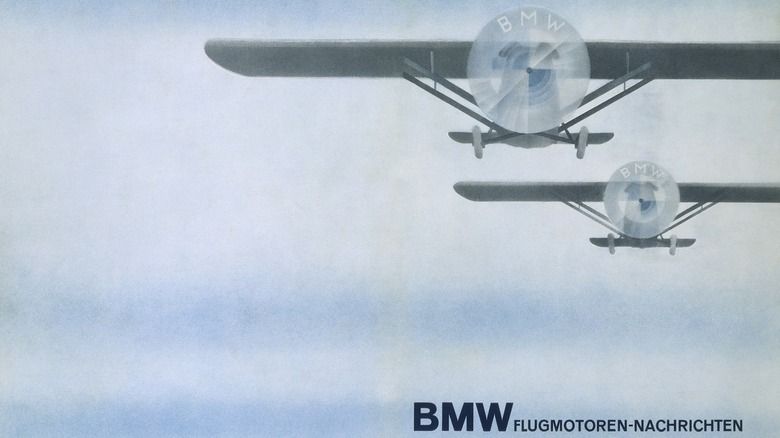
The blue-and-white quadrants haven’t gone anywhere. They have always represented the colors of the state of Bavaria and over the decades, a distinctive lore has developed around them that they represent a spinning propeller, an interpretation that evolved due to BMW’s pre-automotive history as Rapp Motorenwerke, a maker of aircraft engines. The company has extensively addressed this misunderstanding, which it thinks dates to an ad from 1929, depicting the BMW letters emblazoned on spinning propeller blades, an effort to promote a collaboration with Pratt & Whitney.
In BMW’s own account, the company kind of went with the misinterpretation:
“For a long time, BMW made little effort to correct the myth that the BMW badge is a propeller,” Fred Jakobs of BMW Group Classic explained…. Constant repetition has made this explanation a self-propagating urban myth.
Nowadays, BMW has decided that the badge actually does kind of, sort of represent a propeller because the company kind of, sort of encouraged that reading and by not actively discouraging it, allowed it to become canonical.
Over time, the badge has changed a lot
Anyone scrutinizing the updated badge would rightly conclude that BMW has done…not very much, and they’d be correct. But BMW has been doing…not very much when it revises the badge for, oh, about 108 years. The badge first appeared in 1917 and over the course of more than a century, it has basically been progressively modernized. Gold lettering and rings gave way to white, which in turn gave way to chrome. The trend has been one of unrelenting simplification in slow motion, and the new badge is no exception.
For some time now, many of BMW’s design choices have been rather polarizing and controversial. The Chris Bangle era remains debated. Flamboyant deployments of the kidney grille have riled purists. Some folks have a justified nostalgic longing for the more conservative, understated bimmers of the increasingly distant past. But history moves forward. At least with this latest change to the badge, you have to look pretty hard to find anything that might make you mad.


