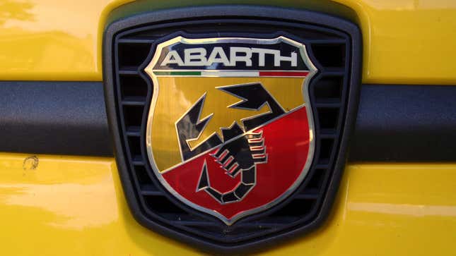
The logos that represent car brands and models often act as a proxy for an otherwise ever-evolving and amorphous concept, so they had better be good ones. When someone thinks about Mercedes-Benz, what do they envision in their head? One of the first things that comes to mind is likely the brand’s iconic three-pointed star emblem. Regardless of how successful these logos are, some are undoubtedly cooler than others, and we want to know which is the coolest?
I think the coolest logo is stuck to the body panels of some of the spiciest little Italian cars around, the zesty offerings of Fiat’s Abarth sub-brand. For whatever reason, many car companies identify with animals, but Abarth’s mascot is a freakin’ scorpion. How cool is that? The Abarth scorpion’s stylized badge looks aggressive and bold, with the angular black arachnid over a distinctive red and yellow backdrop. As someone who lives near the desert, I know that some scorpions are not to be messed with, which I think is a great metaphor for a performance brand.
But what say you? Does the Cybertruck’s chicken scratch logo or its triangular silhouette compel you to love it? Or maybe it’s the classic Chevy bowtie that holds a special place in your heart. Sound off in the comments, and let’s see what the Jalopnik audience thinks are the coolest logos across the vast automotive landscape.


